Rehmat Attar

Luxury Attar E-commerce & Admin Dashboard UI/UX

Overview

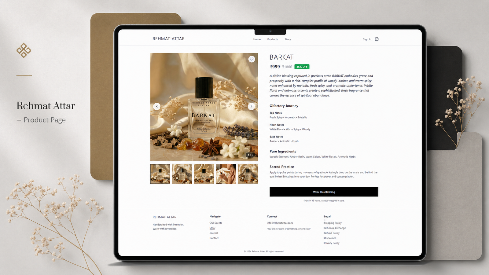
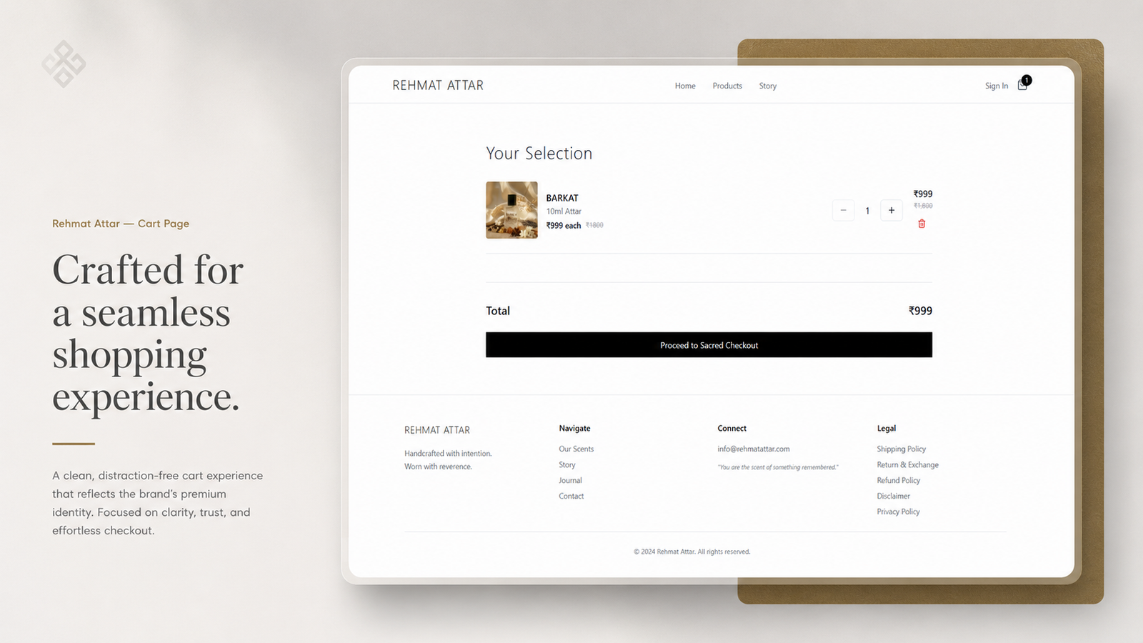
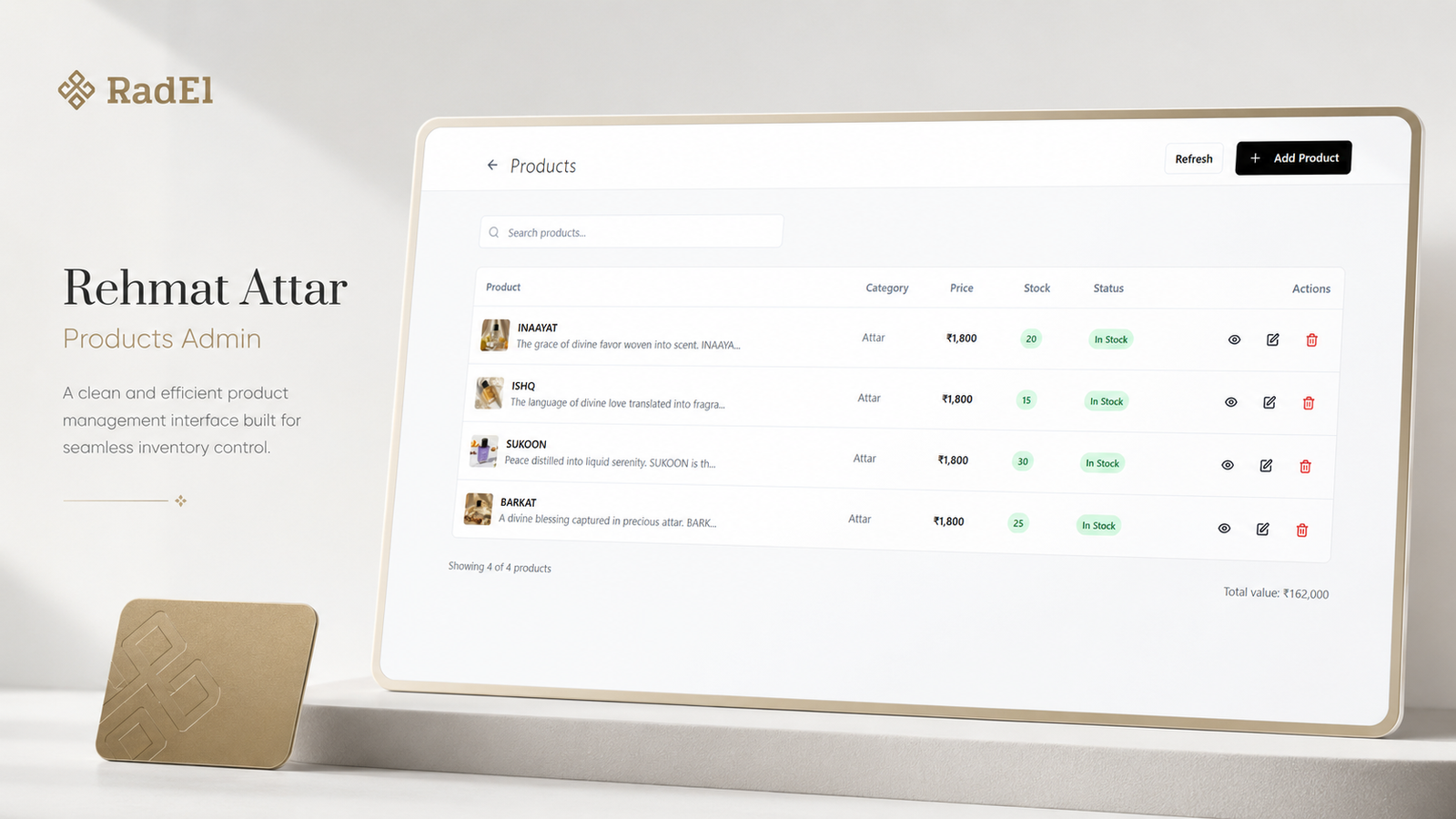
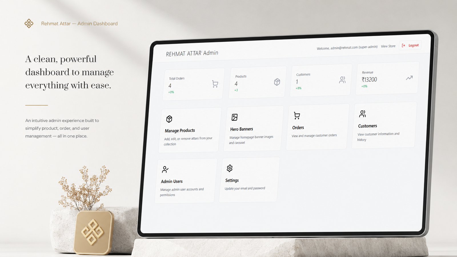
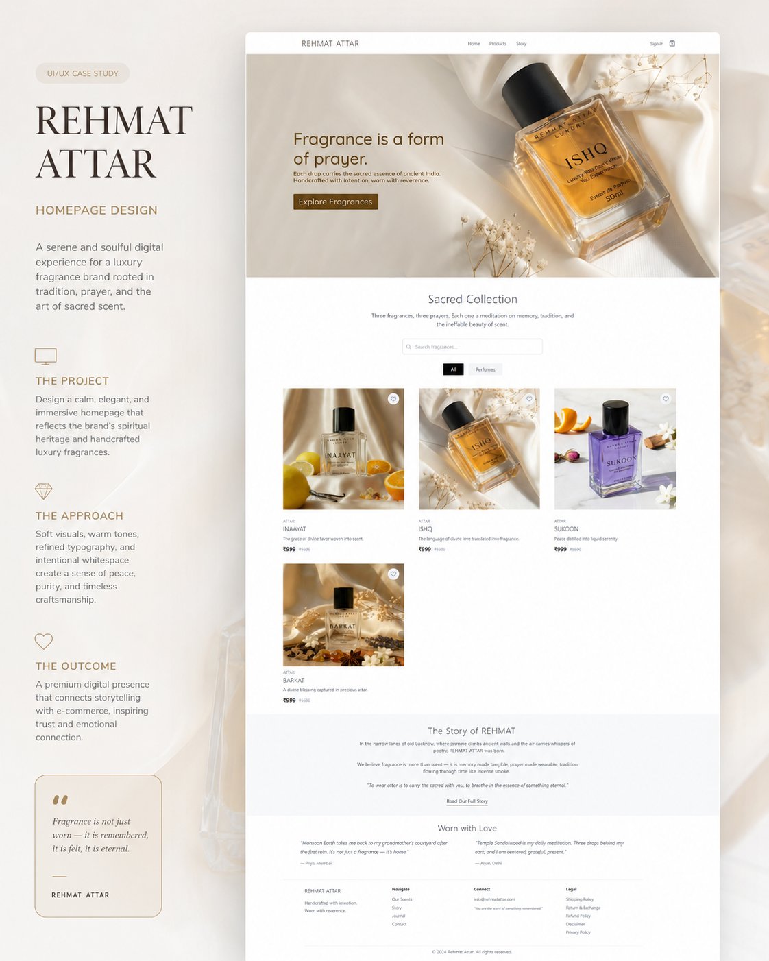
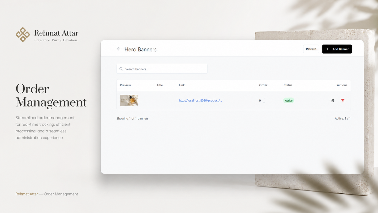
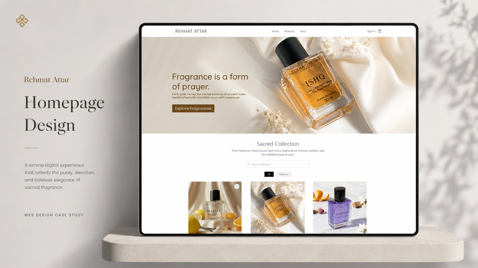
Rehmat Attar is a premium fragrance brand experience designed to bring together spiritual elegance, modern e-commerce, and clean product administration in one seamless digital system. The project included both customer-facing website screens and a refined admin panel for managing products, banners, orders, and inventory. The intention was to create a calm, minimal, and luxurious interface that reflects the essence of attar while also making the backend simple and efficient to use.

The Challenge

The brand needed a digital experience that could balance two very different needs.

On one side, the customer interface had to feel premium, soulful, and visually serene. On the other side, the admin system had to be practical, clean, and easy to manage for day-to-day operations.

The key challenges were:

  • Creating a luxury fragrance experience without making the interface feel heavy
  • Designing a smooth shopping flow across homepage, product, cart, account, and login pages
  • Building an admin dashboard that feels simple and efficient for product and order control
  • Maintaining one consistent visual language across both storefront and backend
  • Reflecting the brand’s purity, devotion, and handcrafted identity through UI

The Objective

The main objective was to build a digital system that looked:

  • Premium
  • Calm
  • Elegant
  • Functional
  • Organized
  • Trustworthy

The website needed to emotionally connect with users through refined visuals and storytelling, while the admin side needed to support smooth management of products, banners, customers, and orders.

Design Approach

1. Visual Concept

The customer-facing UI was designed with a soft luxury approach. Clean layouts, generous whitespace, muted gold accents, and elegant typography were used to create a sense of calm and sophistication.

The admin interface followed the same brand language but in a more functional way. Instead of decorative visuals, the focus shifted to clarity, spacing, table structure, actions, and dashboard overview cards.

2. Color Strategy

The palette was centered around:

  • Soft white and ivory tones for purity and spaciousness
  • Warm gold accents for luxury and sacred elegance
  • Black for contrast and premium definition
  • Subtle neutral grays for clean structure and readability

This combination helped the brand feel elevated and timeless, while also keeping the interface modern and usable.

3. Brand Personality

The visual tone was designed to feel:

  • Serene
  • Premium
  • Spiritual
  • Minimal
  • Refined
  • Trustworthy

Rather than using loud luxury cues, the direction leaned toward quiet sophistication. This made the brand feel more authentic, graceful, and emotionally connected to the product category.
Deliverables

This project included a wide range of branding and visual design assets:

  • Logo Design
  • Secondary Logo Variation
  • Mascot Character Design
  • Expression Illustration Set
  • Packaging Design For Momos
  • Packaging Design For Chicken Items
  • Roll Box Design
  • Product Tag Design
  • Brand Pattern Design
  • Food Illustration Assets
  • Storytelling Graphic Panel
  • Food Truck Branding Concepts
  • Promotional Communication Creatives