Papa Pancho Di Gaddi
Brand identity and packaging system for a playful Punjabi street-food brand
Overview
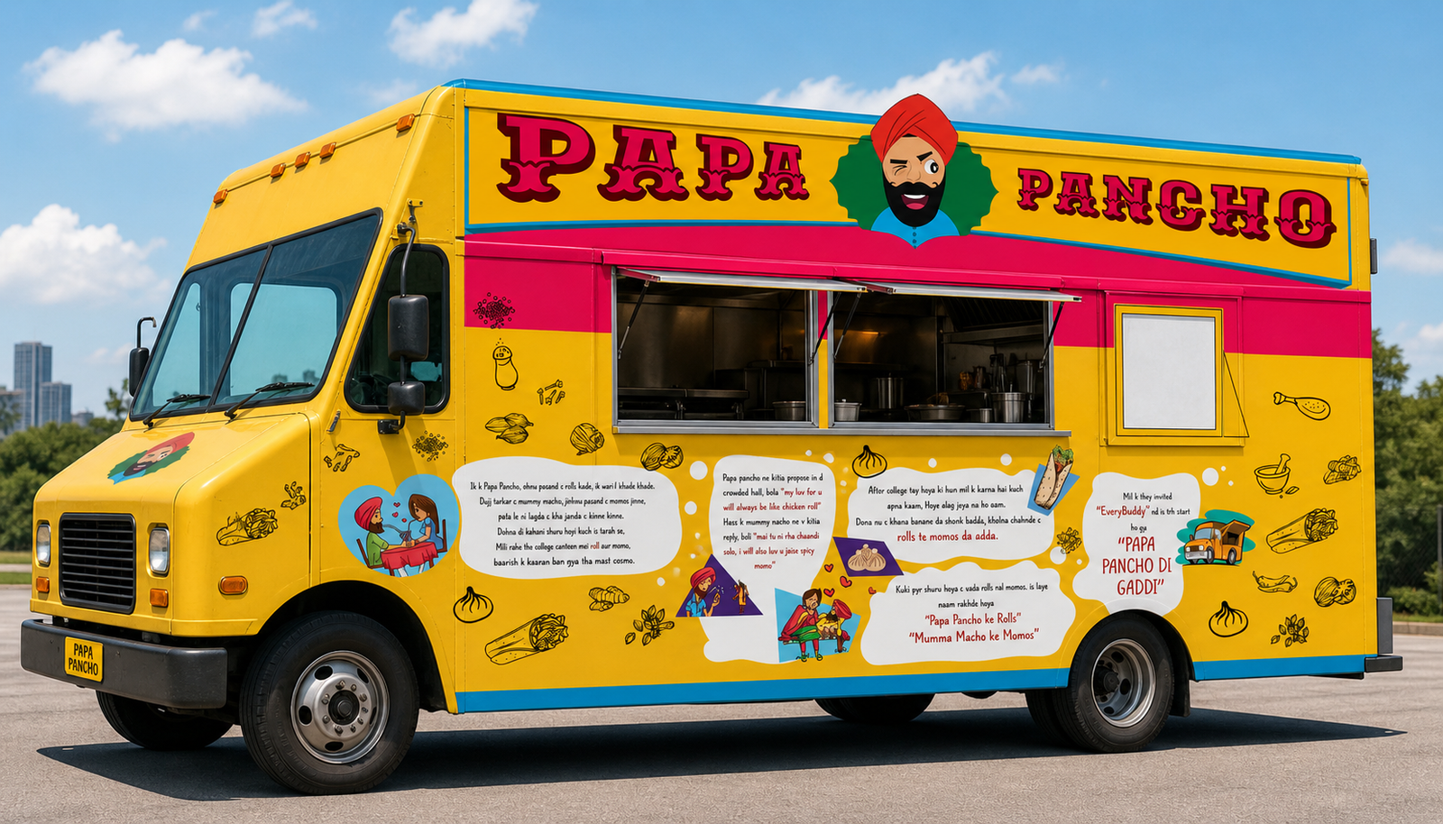
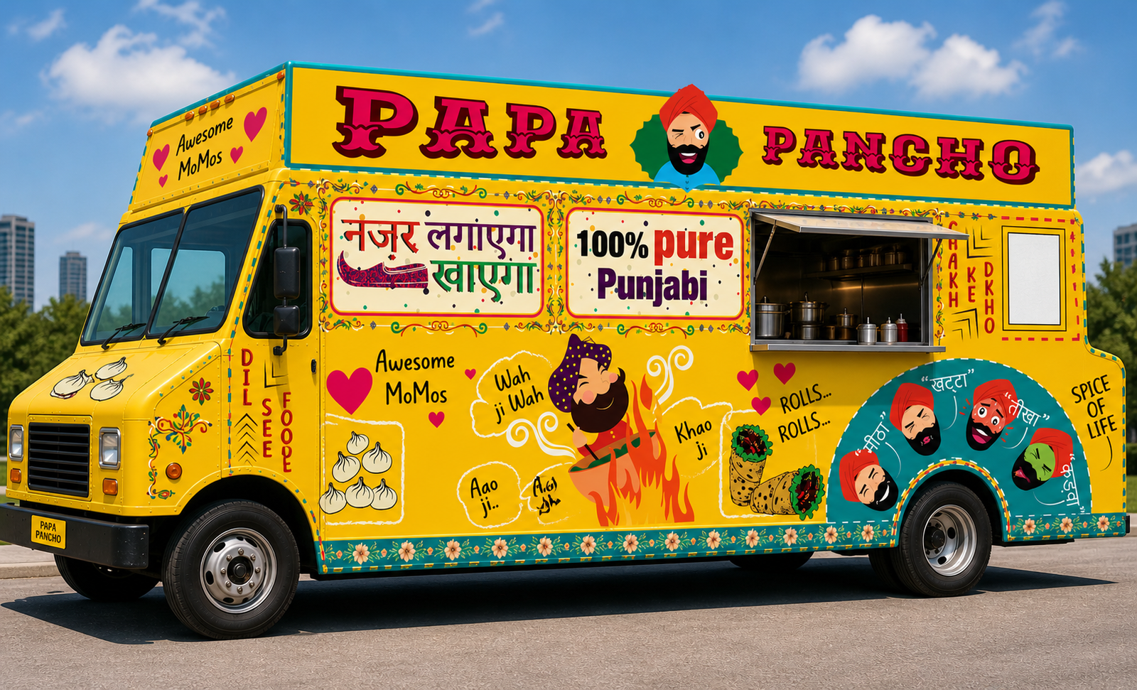
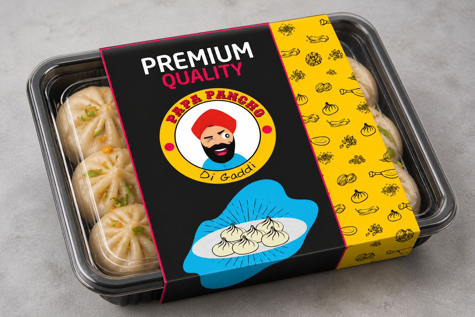
Papa Pancho Di Gaddi is a playful street-food brand built around Punjabi flavor, humor, and bold visual energy. The goal was to create a brand identity that feels instantly noticeable, highly memorable, and full of character across packaging, food truck branding, product tags, and promotional assets. This project covered logo design, mascot development, packaging for different food categories, custom pattern design, storytelling graphics, and food truck applications.
The Challenge
The brand needed an identity that could instantly communicate:
- Punjabi Street-Food Energy
- A Fun And Playful Personality
- Strong Visual Recall
- Flexibility Across Packaging And Truck Branding
Since the brand was not limited to one product, the identity also had to work smoothly across momos, rolls, chicken packaging, food tags, brand storytelling panels, and moving food truck surfaces.
The Objective
The main objective was to build a brand system that looked:
- Loud And Memorable
- Fun And Expressive
- Easy To Recognize
- Flexible Across Different Food Categories And Formats
The identity had to feel bold enough to grab attention from a distance, but structured enough to stay consistent across all brand applications.
Design Approach
1. Logo Concept
The logo was designed around a mascot-based identity to give the brand a strong face and instant recall. The turbaned character adds humor, warmth, and Punjabi personality, making the brand feel more alive and relatable.
The circular logo format helps the mark feel badge-like and easy to apply across multiple surfaces such as:
- Packaging
- Product Tags
- Signage
- Truck Branding
A secondary horizontal logo was also developed to support wider branding spaces and create better usability across large-scale applications.
2. Color Strategy
The palette was centered around bright, high-energy colors that naturally support a street-food personality:
- Yellow For Energy, Warmth, And Attention
- Pink For Playfulness And Brand Punch
- Blue For Contrast And Visual Balance
- Black For Outlines, Definition, And Readability
This combination helps the identity feel bold, youthful, and highly visible in busy food environments.
3. Brand Personality
The visual tone was designed to feel:
- Fun
- Expressive
- Quirky
- Bold
- Culturally Rooted
Rather than making the brand look polished or minimal, the direction leaned toward exaggeration, humor, and visual storytelling. This helped the brand stand out with a stronger emotional and entertainment value.
Deliverables
This project included a wide range of branding and visual design assets:
- Logo Design
- Secondary Logo Variation
- Mascot Character Design
- Expression Illustration Set
- Packaging Design For Momos
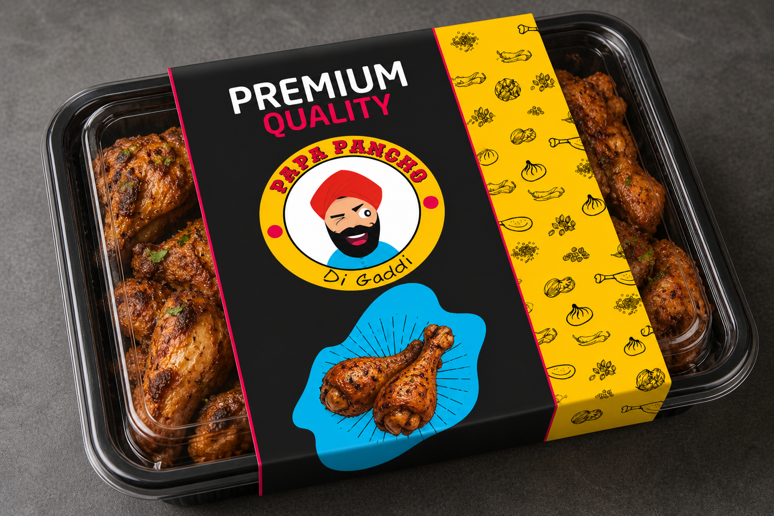
- Packaging Design For Chicken Items
- Roll Box Design
- Product Tag Design
- Brand Pattern Design
- Food Illustration Assets
- Storytelling Graphic Panel
- Food Truck Branding Concepts
- Promotional Communication Creatives