Ricky’s Deal

E-Commerce Website UI Design

Overview

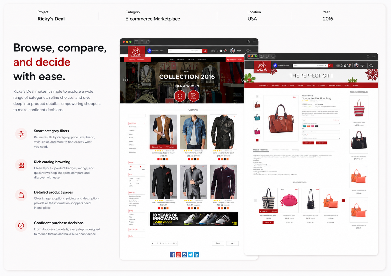
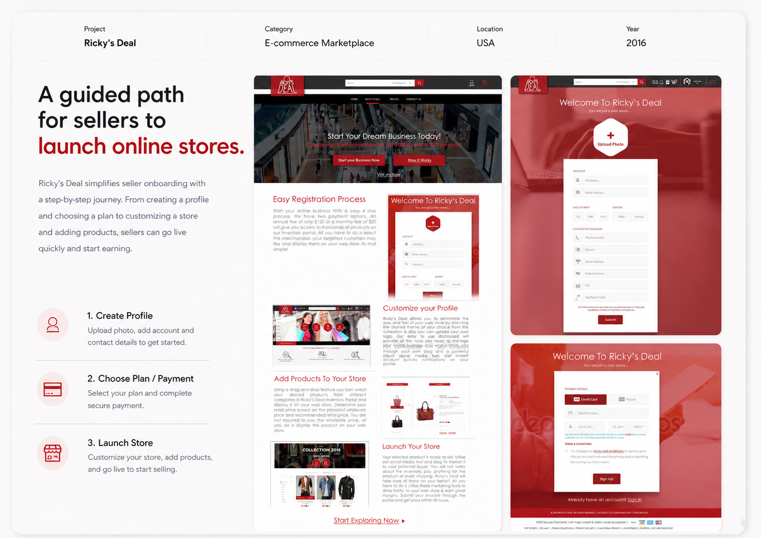
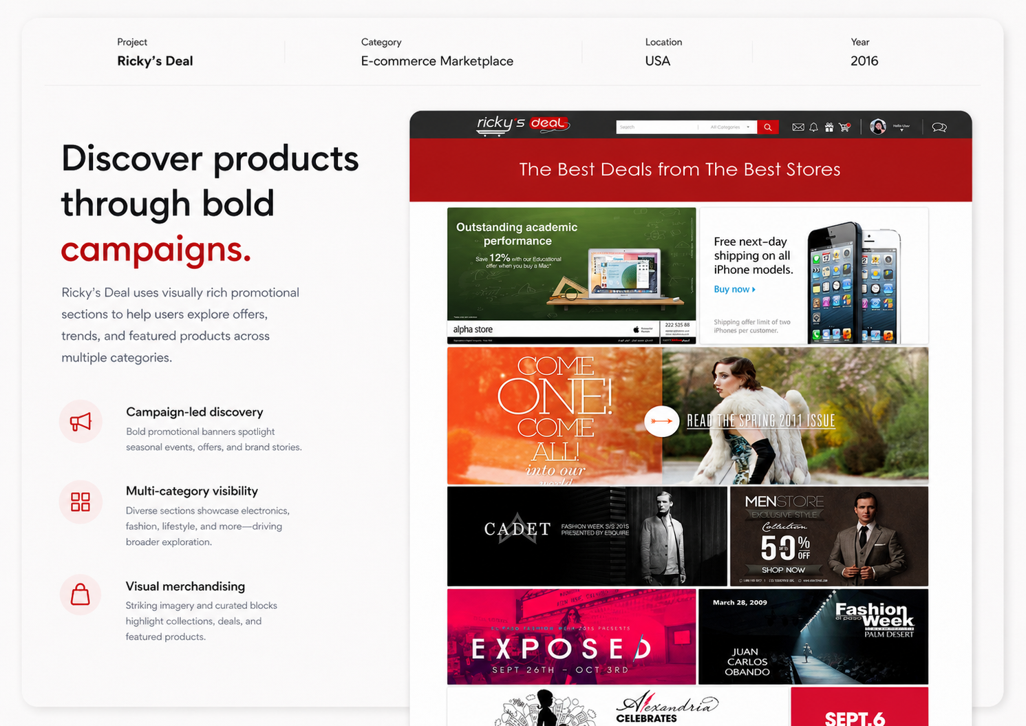
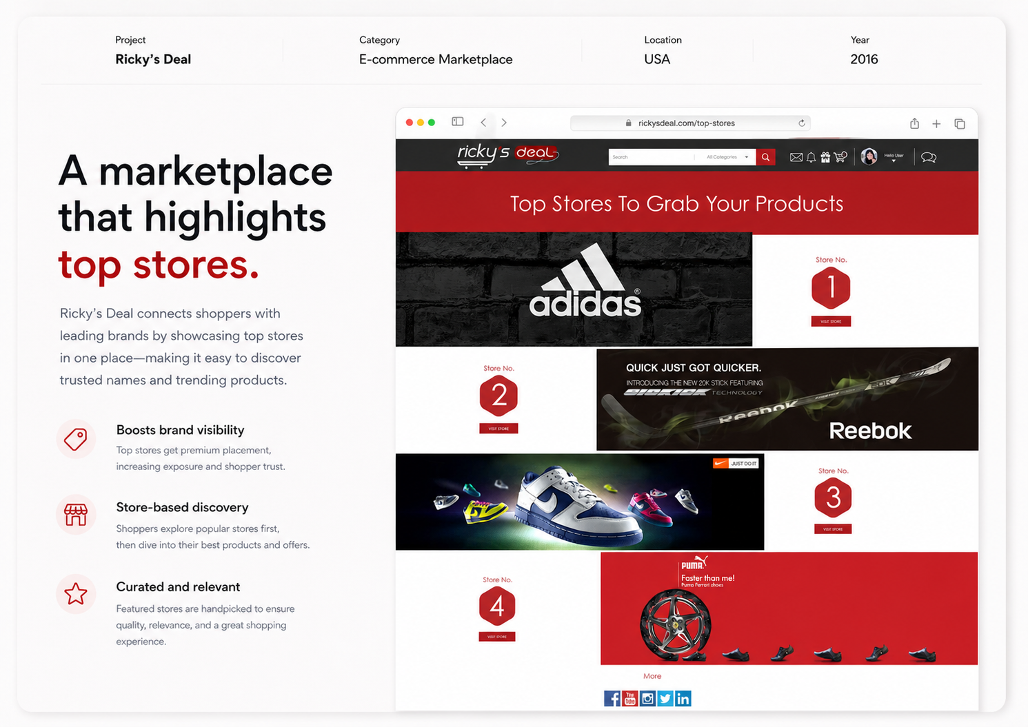
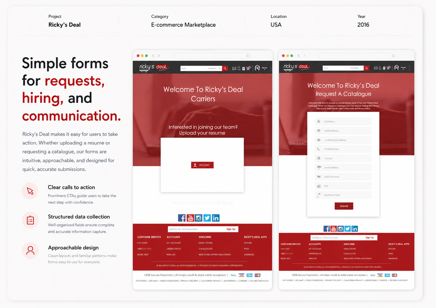
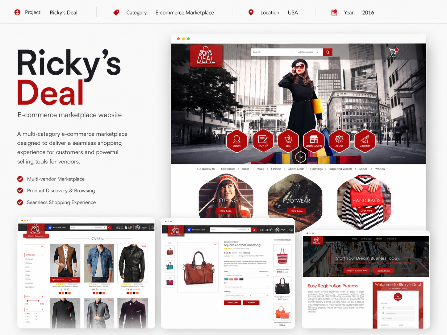
Ricky’s Deal is an e-commerce platform concept created to bring together multiple product categories, store listings, user accounts, and seller-side features inside one unified shopping experience. The project focused on designing a complete website interface that could handle product discovery, product purchase, user registration, profile setup, catalogue requests, career applications, and vendor onboarding. The goal was to create a UI system that felt functional, familiar, and conversion-focused while supporting a large number of pages and user journeys.

The Challenge

The platform needed a user interface that could instantly communicate:

  • A Clear E-Commerce Experience
  • Easy Navigation Across Multiple Categories
  • Trust During Checkout And Account Creation
  • Support For Both Customers And Sellers
  • Consistency Across Many Different Web Pages

Since the website included product listing pages, product detail pages, account flows, order confirmation pages, catalogue request forms, terms pages, careers, and vendor onboarding, the design also had to stay visually consistent across a wide range of layouts.

The Objective

The main objective was to build a website system that looked:

  • Clean And Easy To Navigate
  • Familiar For Online Shoppers
  • Structured Across Different User Journeys
  • Functional For Both Buying And Selling
  • Consistent Across Full Website Screens

The interface had to make browsing, purchasing, and seller registration feel simple while maintaining one recognizable visual language throughout the platform.

Design Approach

1. Logo Concept

The logo was designed around a mascot-based identity to give the brand a strong face and instant recall. The turbaned character adds humor, warmth, and Punjabi personality, making the brand feel more alive and relatable.

The circular logo format helps the mark feel badge-like and easy to apply across multiple surfaces such as:

  • Packaging
  • Product Tags
  • Signage
  • Truck Branding

A secondary horizontal logo was also developed to support wider branding spaces and create better usability across large-scale applications.

2. Color Strategy

The palette was centered around bright, high-energy colors that naturally support a street-food personality:

  • Yellow For Energy, Warmth, And Attention
  • Pink For Playfulness And Brand Punch
  • Blue For Contrast And Visual Balance
  • Black For Outlines, Definition, And Readability

This combination helps the identity feel bold, youthful, and highly visible in busy food environments.

3. Brand Personality

The visual tone was designed to feel:

  • Fun
  • Expressive
  • Quirky
  • Bold
  • Culturally Rooted

Rather than making the brand look polished or minimal, the direction leaned toward exaggeration, humor, and visual storytelling. This helped the brand stand out with a stronger emotional and entertainment value.
Deliverables

This project included a wide range of branding and visual design assets:

  • Logo Design
  • Secondary Logo Variation
  • Mascot Character Design
  • Expression Illustration Set
  • Packaging Design For Momos
  • Packaging Design For Chicken Items
  • Roll Box Design
  • Product Tag Design
  • Brand Pattern Design
  • Food Illustration Assets
  • Storytelling Graphic Panel
  • Food Truck Branding Concepts
  • Promotional Communication Creatives