Fresheas
A warm and fresh food brand identity designed to feel homemade, cheerful, and instantly familiar.

Overview
Fresheas was envisioned as a food brand that feels fresh, comforting, and easy to connect with from the very first glance. The goal was to create a visual identity that could reflect the warmth of homemade food while still feeling vibrant and memorable across modern brand touchpoints.
The Challenge
The brand needed an identity that could instantly communicate:
- Fresh and appetizing food
- Warmth and comfort
- A friendly and approachable personality
- Strong visibility across both print and digital applications
Since food branding is highly visual, the system also had to adapt smoothly across packaging, labels, menu cards, social media, takeaway materials, and promotional assets.
The Objective
The main objective was to build a brand system that looked:
- Fresh and inviting
- Easy to recognize
- Warm and culturally familiar
- Flexible across different surfaces and formats
The identity had to feel simple enough for broad appeal, but distinctive enough to create recall.
Design Approach
1. Logo Concept
The logo was designed to capture the feeling of freshness and everyday food comfort in a simple, memorable way. The visual direction combines a soft, food-friendly form with expressive lettering to make the brand feel approachable and full of personality.
The rounded structure helps the identity feel:
- Friendly
- Homemade
- Appetizing
- Easy to remember
The overall logo style avoids looking overly premium or corporate. Instead, it leans into warmth, familiarity, and freshness.
2. Color Strategy
The palette was centered around colors that naturally connect with food, freshness, and appetite:
- Red tones for energy, appetite, and strong recall
- Yellow or golden tones for warmth and richness
- Green accents to suggest freshness and natural ingredients
- White for clarity, balance, and readability
This combination helps the identity feel lively, welcoming, and well-suited for food-based communication.
3. Brand Personality
The visual tone was designed to feel:
- Warm
- Cheerful
- Fresh
- Approachable
- Family-friendly
Rather than making the brand look too formal or too modern, the direction focused on emotional familiarity. This makes Fresheas feel like a brand rooted in taste, comfort, and daily food joy.
Deliverables
This project included a wide range of branding and visual design assets:
- Logo Design
- Brand Look and Feel
- Color and Typography Direction
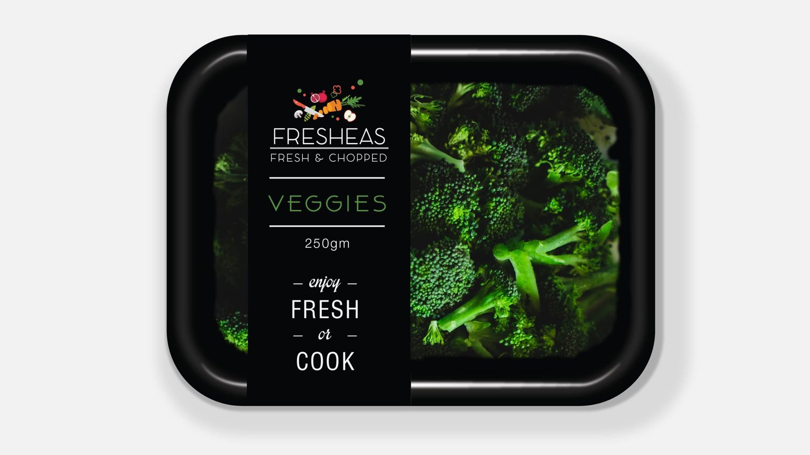
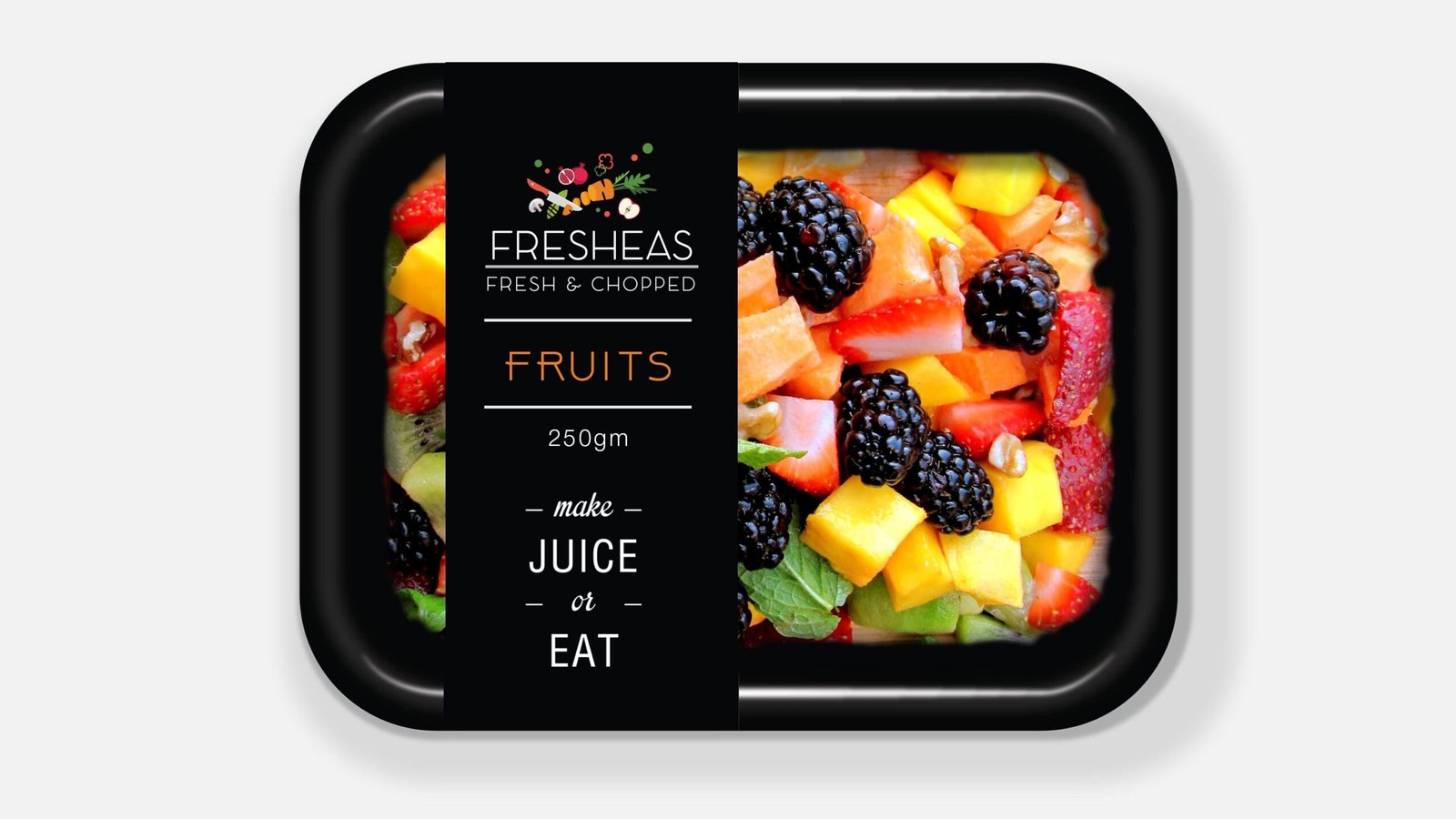
- Packaging Applications
- Label and Sticker Design
- Menu Design
- Social Media Post Creatives
- Takeaway Branding
- Promotional Communication Assets
- Stationery Design
- Brand Mockups