Limbskart
Brand identity and visual system for a modern mobility and orthotics brand
Overview
Limbskart needed a visual identity that could feel trustworthy, medical, approachable, and forward-looking at the same time. The brand had to work across digital interfaces, stationery, packaging, promotional materials, and physical touchpoints while maintaining a clean and recognizable presence.
The Challenge
The main challenge was to create a brand system for a healthcare-adjacent business without making it feel cold, outdated, or overly clinical. The identity needed to communicate movement, support, recovery, and optimism, while also remaining functional across multiple applications like business stationery, app screens, ID cards, apparel, signage, and branded merchandise.
The Objective
The goal was to build a professional and scalable identity system that gives Limbskart a clear visual personality. The brand had to inspire confidence, feel accessible to users, and translate smoothly across both print and digital environments.
Design Approach
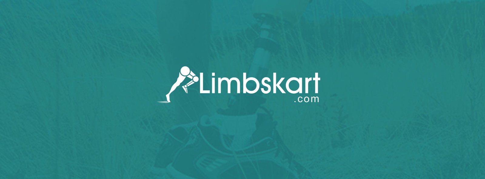
1) Logo Concept
The logo combines a human movement-inspired symbol with a modern wordmark to reflect mobility, rehabilitation, and progress. The symbol visually hints at assisted movement and physical support, making it relevant to the brand category while keeping the identity simple and memorable. The wordmark was kept clean and contemporary so it could balance the symbolic mark and remain legible across all touchpoints.
2) Color Strategy
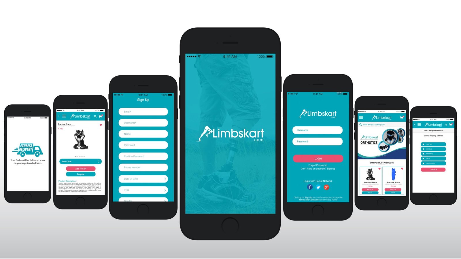
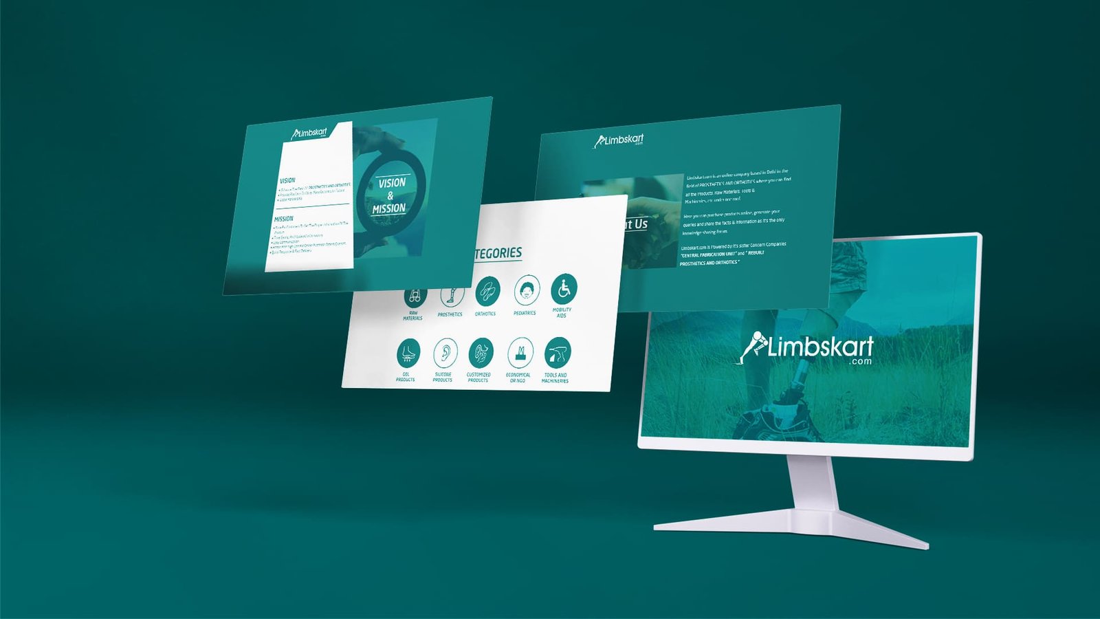
The visual system uses a fresh teal-blue palette paired with white and light neutrals. This helped the brand feel clean and medical, but still optimistic and modern. The color choice also gave the identity a calming and supportive tone, while making it highly adaptable for both digital UI screens and physical brand materials.
3) Brand Personality
The brand personality was shaped around four key qualities: supportive, modern, optimistic, and dependable. This comes through in the clean layouts, minimal use of decorative elements, soft curves, and balanced white space. Across every application, the identity aims to make the brand feel professional yet human.
Deliverables
- Logo design
- Brand color palette
- Typography system
- Business card design
- Letterhead design
- Envelope design
- ID card design
- Presentation deck design
- Facebook cover design
- App screen mockups
- Branded mug design
- Branded cap design
- Branded T-shirt design
- Packaging tape design
- Event backdrop design