Amma Ki Rasoi
Brand Identity, Packaging & Social Media Design
Overview
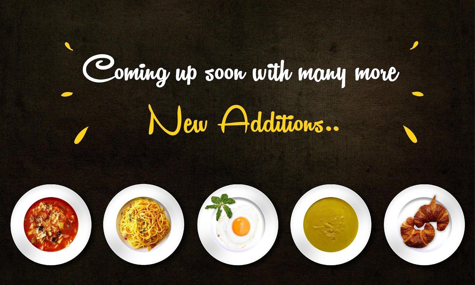
Amma Ki Rasoi is a food brand built around warmth, comfort, and familiar homemade taste. The goal was to create a visual identity that feels inviting, memorable, and rooted in the emotional connection people have with home-style food. This project covered logo design, menu design, stationery, packaging mockups, social media creatives, and brand applications across multiple touchpoints.
The Challenge
The brand needed an identity that could instantly communicate:
- Homemade food
- Warmth and comfort
- A friendly and approachable personality
- Strong recall across print and digital platforms
Since food brands are highly visual, the identity also had to work smoothly across packaging, menu cards, social posts, tote bags, takeaway boxes, stickers, and stationery.
The Objective
The main objective was to build a brand system that looked:
- Appetizing
- Easy to recognize
- Culturally warm
- Flexible across different surfaces and formats
The identity had to feel simple enough for mass appeal, but distinctive enough to stand out.
Design Approach
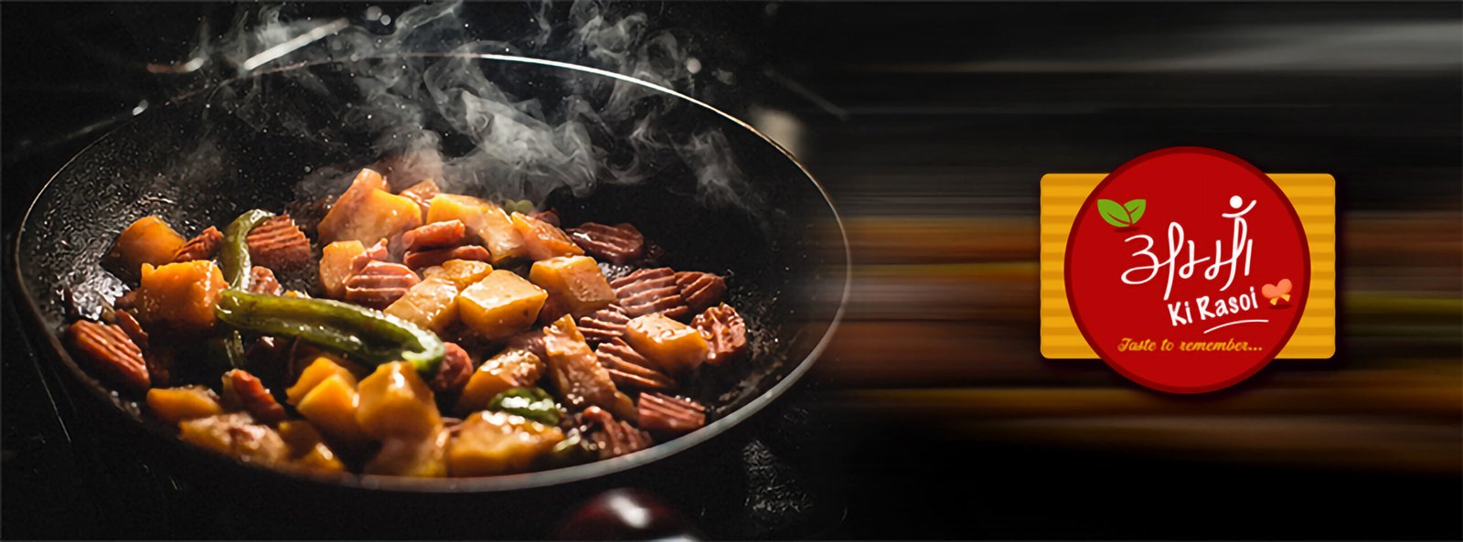
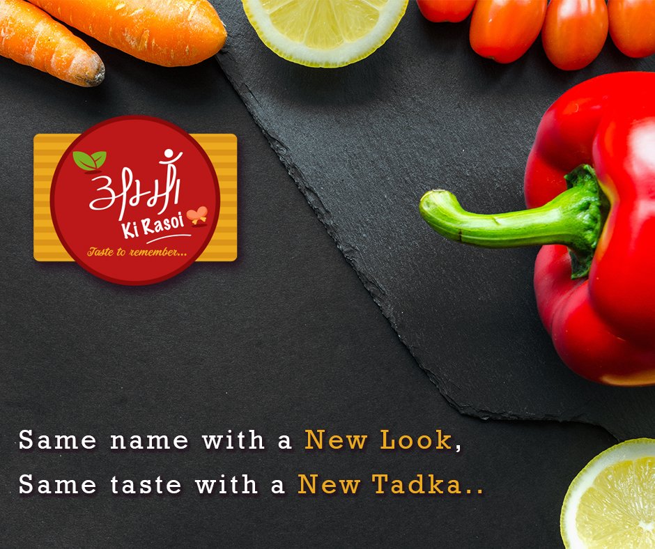
1. Logo Concept
The logo uses a bold circular red form placed over a wooden base element. This instantly gives the feeling of:
- A Serving Plate
- A Kitchen Board
- A Warm, Food-Centric Badge
The hand-drawn style lettering adds a personal and homemade feel, while the leaf and food-inspired icon details support the freshness and kitchen identity of the brand.
2. Color Strategy
The palette was centered around:
- Red For Appetite, Energy, And Recall
- Yellow/Golden Tones For Warmth And Food Richness
- White For Contrast And Readability
- Wood-Inspired Base Tones To Reinforce The Kitchen And Handmade Feel
This combination helps the identity look vibrant and food-friendly across all applications.
3. Brand Personality
The visual tone was designed to feel:
- Warm
- Cheerful
- Rooted
- Approachable
- Family-Friendly
Rather than making the brand overly premium or too modern, the direction leaned toward emotional familiarity, which suits a food brand built around taste and comfort.
Deliverables
This project included a wide range of branding and visual design assets:
- Logo Design
- Brand Look And Feel
- Stationery Design
- Menu Design
- Packaging Applications
- Sticker / Label Mockups
- Tote Bag Branding
- Takeaway Cup And Box Branding
- Social Media Post Creatives
- Facebook Cover Design
- Promotional Communication Creatives